Browse Storybook
To help you visualize the user interface components that are used in the React PWA Reference Storefront, the react-pwa-reference-storefront project includes an implementation of Storybook. Storybook is a third-party, open-source tool for developing, testing, and displaying UI components in isolation of an application. In general, a story in Storybook displays a single visual state of a component. With Storybook, you can review the UI components and choose the ones that you want to consume.
Note: Storybook is optional. You can consume the UI components for the storefront without using Storybook.
Public Storybook for the React PWA Reference Storefront
When you want to browse the components or show others what is available, use the public instance of Storybook.
Local Storybook for the React PWA Reference Storefront
When you want to edit and add components, run a local instance of Storybook. Storybook for the storefront is located in the storybook directory. Storybook includes a story for each component in the src/components/src directory. The story is defined in the .tsx file within the component directory. You can add additional stories for any custom components that you create.
Running Storybook
Use yarn to run the storybook project. In Storybook, each story shows you an image of the selected component.
Go to the
storybookdirectory and run the project.…/react-pwa-reference-storefront/storybook> yarn storybookFrom the sidebar, select a component.
For example, if you select
CartMain, the cart component appears with sample items, data, and default styling.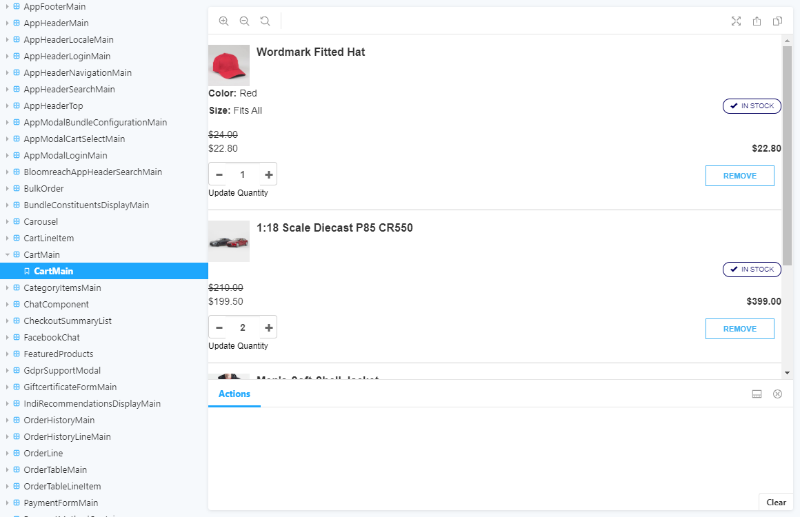
Creating Storybook stories
If you create custom React UI components, you can add stories for the custom components to your local Storybook instance. For more information about writing stories, see Writing stories in the Storybook documentation.
In the
src/components/srcdirectory, find the custom component.In the
src/components/src/<customComponent>directory, create a<customComponent>.stories.tsxfile, where the file prefix shares the same name as the directory.For example, if the component directory is
src/components/src/mycomponent, then the story file must be namedmycomponent.stories.tsx.In the
<customComponent>.stories.tsxfile:- Update the story with the necessary response structure data from Cortex.
- Add all required components and content for the component.
- Import the component which the story belongs to as required.
Tip: Use an existing <component>.stories.tsx file as a reference for the content in your <customComponent>.stories.tsx file.